Thursday, March 31, 2011

CR84FN Color Challenge

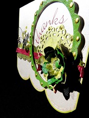
I stumbled across this site through Lindy and thought I would give it ago, this weeks colors were stunning. I don't really make cards but thought I would start making them ready to give away as presents. This is my take on this weeks, it was interesting to do the Color Chartreuse when CCG used the same name for their color but they look totally different.


P1030722

Hope you enjoyed looking and thanks for any comments you may leave.


Pin It!

Wednesday, March 30, 2011

Color Combos Galore 185

This weeks inspirational picture inspired patchwork on my page. I love quilting but unfortunately don't get to quilt as often as I would like. Originally I was going to use fabric but after scouring through my hoards of fabric I could not find one fat 1/4 suitable for this weeks colours. I did find some scraps in my stash that I thought was close to the Lustrious Chartreuse. What is this colour you ask? Its basically a yellow and a green combined. So it would be more of yellow colour with a green tone.

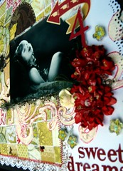
I loved this picture of my DD taken by my mother, I don't think it was of any occasion other than the peaceful look of sleep. which I am sure Nana's appreciate..lol The photograph of the layout isn't the best, it is raining here again which I'm sure it does every time I need to photograph....


Sweet Dreams 1

For the background I have used Fancy pants and some white cardstock that I punched with a Martha Steward border punch. I stamped a frame using Tim Holtz distress ink along with a 7Gypsy stamp. This is where a quilting ruler comes in handy for cutting out all those 1" squares. Papers used for the patchwork are Pink Paislee, Websters and a unknown brand I also over layed a few of the squares with some embossed acetate pieces. I machined stitched with zig zag to create a border and Basic Grey was used to create a heart also incorporating the flower pattern. I used dimensional pearls in the centre of the flower.

Donna Downey foam stamp was used with white paint and I traced around with a red zig pen. Other products used are Kaiser flowers, Websters, Cosmo Cricket and MM Stickers. Kaiser rubons, kindy glitz. Thanks for looking.


Pin It!

Tuesday, March 29, 2011

THE PARTY STARTS FRIDAY

The party starts Friday so let's spread the word! You can all help make this the biggest birthday bash ever!

Post our party invite to your blog, Facebook, Twitter or anywhere else you can. Go back to http://papersecrets.friendhood.net/t1387-paper-secrets-birthday-bash-pre-party-contest and reply with a link to where you posted. You will get 1 prize entry for each place you post. I will draw a winner on Friday who will get a really fun prize full of tickets, bling, ribbon, flowers & more.


be sure to also post a link to our forum...
http://papersecrets.friendhood.net/forum

Have a great week & we'll see you Friday!


Pin It!

Saturday, March 26, 2011

Anniversary Card/Guest Book

My mum asked me to make a card similar to the one I did for her 60th Birthday, It was a card from me but I also made it so that her guests could also leave her a Birthday wish. So this one is for a friends 50th Wedding Anniversary. I used the Kaiser Chipboard album and have covered it with Websters papers.


On this page I have made a pocket and inserted a set of tags so that they can add some journalling about their night.


On this page I have made it so that not only can guests sign but any memorabilia can also be slipped in behind the pockets.


I have made a little mini concertina album so that they can add some photos from the night.


I have 3D the flowers and left this for more signing by guests.


Thanks for looking.


Pin It!

Thursday, March 24, 2011

Color Combos Galore 184


It’s still Fashion Week over at CCG! This week’s inspiration challenge was inspired by all that gorgeous sheer fabric in the inspiration photo. The challenge was to Focus on Product this week -- include sheer fabric and/or ribbon in your project.

I wasn't overly inspired by the picture but I was by the colours. I was sent this picture from my Sister In-law of my Newphew and Niece taken last year whilst they were attending their Aunty's Wedding. I was blown away at how grown up they look.

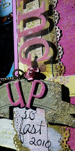
I have used old papers from K & Co and Basic Grey. Photo was matted with DBugs textured cardstock. All the flowers were cut from a Basic Grey paper and a unknown paper. I used 3D foam to raise them and added some ribbon. Dusty Attic lazer cut was used and I have altered using gold leaf. The background paper is white washed co-ordination cardstock that I felt looked a little plain so I pulled out my trusty old fiskard embossing brick plate and embossed the background before inking and spritzing. Stickers are an old making memories felt ones that I have chalked. Other products are Websters and American Craft Alpha stickers. These combos are such a great way to really look into your stash and use some of that old product. Challenge yourself to make old look new.

Growing Upa

Thanks for looking and I hope this has at least inspired someone to use their old products.


Pin It!

The Color Room 50

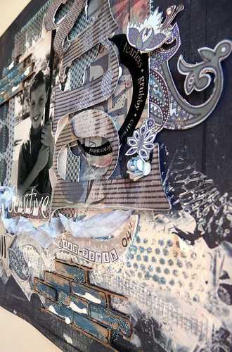
I loved the Challenge of these white wash colors although I don't find the colors are showing up as good when photographed. The photo is of my son that my sister in-law photographed whilst he was over in Perth.

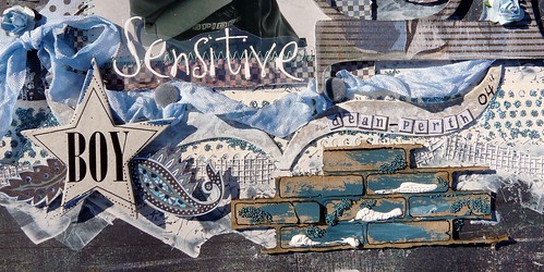
I decided to go with some old and new Basic Grey papers. The old Phresh & Phunky and Vagabond card folders were used for mats and I also used the matching monograms and I randomly stitched around the page. At the bottom of the paper I have used white paint and Tim Holtz stamp and then applied mesh, magic dotti and mirco beads.

I couldn't pass by the Dusty Attic brick lazer cut, I altered this by painting, micro beading and I also used puffy paint. I was trying to achieve a grungy yet soft layout to describe my son at that age.


Kind & Sensitive

Kind and Sensitivea
Thanks for looking and I hope you enjoyed looking. If you have any questions feel free to ask.


Pin It!

Wednesday, March 16, 2011

The Color Room Palette 49

Lots of pink over at the color room this week, at first I wasn't going to play along. My reason you ask??? Simply because I can be a bit of a colour Nazi. Why am I like this, I don't know, it could stem back to my childhood days....hmmmm, way back when I pack my clothes away into drawers by colour. Yes I actually did this.

Anyway Im getting off track, it annoys me when you can clearly see the colors of the palette and yet a completely different color is used. Ok so their is more than one shade of white, but if I threw my white shirt into the wash and it came out pink would I still call it white? Possibly not, so if the color is a dusky pink, how does it then become watermelon or hot pink???

And I have to agree these colour palettes can be quite challenging, hence the fact that its a challenge site. I get that we don't always have what we need in our stash, but to succeed and get as close as possible I have mixed paints, shimmers and chalks to get the desired color, messy....indeed it is, but that is why it is a challenge!!!!

My take of this weeks colour palette and I can tell you it was hard to get those colours remotely perfect, but I did try my best. I found by mixing Burgundy paint with Grey almost got me the colors I was looking for.


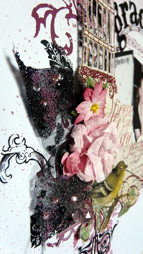


Graduation Yr9 a

My up close shot is showing you skeleton leaves that I have embellished.

Thanks for looking and I hope you enjoyed.


Pin It!

Tuesday, March 15, 2011

Websters March Challenge

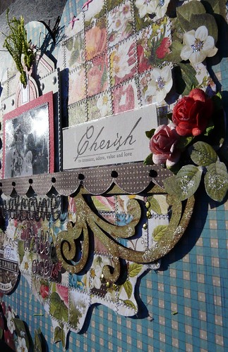
Yes Websters Papers are one of my favorite company's. I love the versatility of their papers, since I love cutting and re-arranging so much I thought I would work a patchwork watercolor heart wreath into my layout as part of the challenge. Which brings me to the challenge. You had to make a shaped background, it didn't even occur to me just to grab one of their pre-made die cut papers as really where is the challenge in that. So yes, I cut out 110 1" squares from Websters scraps, this then had to be pieced in such a way that it forms a heart wreath. When finished I stitched them all down. This actually creates a 11.5" square so I had to cut it out to make the shape background. Unfortunately once I did this I wasn't happy with using it directly as the background and lose the effect of all the work I had done. So I used another sheet of Websters Papers "Set the Table". I cut the top of it to frame the heart part and then used decorative scissor down the bottom rh corner and cut into the pattern work to create my shaped background. From there I used more scraps of flowers and leaves from the paper and 3D them over the other pattern work.


Welcome Little One a

Photo is of my mum and her parents, on this occasion I think it was introducing her to the family. I have matted the photo and then matted again onto a Making Memories metal frame. Both of these have a Chatterbox journal tag placed behind for journalling. Other products are Making Memories Cherish sticker, Webster alpha stickers, prima flowers, dusty attic flourish, kindy glitz and dimensional pearls. Thanks for looking and for any of your comments you may leave.


Pin It!

Monday, March 14, 2011

Color Combos Galore 183

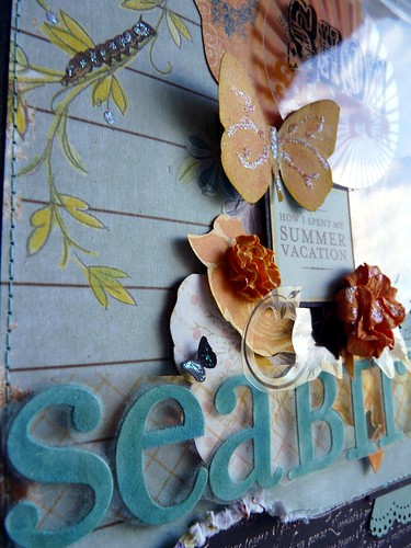
Color Combos Palette 183 and Inspiration picture were very inspiring this week. Butterflies always make me think of summer and I have had this photo of my niece for ages waiting for the perfect palette to appear. My sister inlaw is pretty good at taking pictures, even if I say so myself, and I love how she has taken this one just at the right moment that the color of the sun setting is reflecting in her hair.


Show Stoppera


Papers: SR Italian Script Black, Websters Paper,Bling Bazzill, unknown Kaiser Scrap and Safafrass. Embellishments are from: MM stickers,MM felt letter stickers colored with Pebbles Inc pearlescent chalks. KF rubons, Kaiser flowers, Heidi Swapps Street Smart, Pink Paislee Journal sheet. Kindy Glitz

Tools - Matha Stewart Lace doiley and butterfly. EK success Scallop border.

Thanks for looking and your comments in advanced.


Pin It!

Tuesday, March 8, 2011

Color Combos Galore 182

This week over at Color Combos Galore we have hit the catwalk at a nice easy pace with lovely monochromatic tones. As soon as saw them I thought vintage and its another good excuse to work on my old family photos. This picture was taken of both my Great Grandma and Grandma who unfortunately passed when I was 6 months old. I loved how everyone used to dress up in their best and head to the city where you would also be lucky enough to photographed. My Great Grandma also used to make their clothing so I thought it was a very fitting photo for this weeks challenge.
My layout photo is throwing a little blue on my grey colors, I assure you they are definitely silver grey. The background is a very old Sweetwater paper and the punched centre is MME Lost and Found scrap I had. A MME vintage frame was cut in half and tucked behind at the top and bottom of this. I cut a dress shape from calico and adhered this to a Dusty Attic dress form. The bow was made from seam binding and spritzed with Silver Sugar from Tattered Angels. I distressed some twill and stitched down using the machine and a green cotton. Flowers were cut using Tim Holtz die from some of the leftover twill. Other products used are: Making Memories metal frame, October Afternoon stickers, Prima flowers and pearls, Websters letter stickers, pins and some unknowns.

Thanks for looking and hope your inspired enough to come on over and try the palette yourself, before you know it you will be addicted to it.


Pin It!

Wednesday, March 2, 2011

Color Combos Galore 181

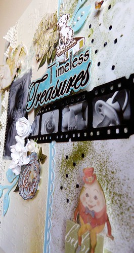
Loved the beautiful soft colors in this weeks palette, so I decided to use one of the rare pictures I have of my mother when she was a baby.

I decided to go into the archives this week and retrieved some old Chatterbox Apple Green Big Dots and K & Company Embossed Story Time. The turquoise paper is the reverse side of a WR Memories old valentine range. I used a QK die for the background mask and some olive TA mist. The newest paper used is a small die cut heart from Websters and I used 3 different border punches and some old lace, once all this was layered I stitched down both sides of the borders.

The film strip die is T Holtz and the little picture are an old Pebbles Inc sticker. Elements have been cut from K & Co Story Time, Websters and Kaiser. Flowers are hand made. Thanks for looking.


Timeless Treasuresa


Pin It!

The Color Room 47

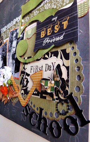
This weeks color room colours where a little tricky to say the least. On screen the yellow/orange color looked like a deep mustard color yet when printed out onto photo paper it came out more a deep orange. Looking at the Design Teams layout didn't help as they seemed to have had the same confusion. So this in the end is my take on the colors. My


School a

Papers used for this layout are Karen Fosters Chalkboard, Cosmo Cricket Circa 1934, Crate Papers Honey Pie, Crate Paper Die cut and Hambley Doily Transparency. Elements are cut from Sassafrass, Circa papers and Theresa Collins. Stickers are Pink Paisley and K & Company. Other elements are rubons and flowers.

Thanks for looking


Pin It!