Tuesday, September 27, 2011

HMITM Challenge 181 - September 26

Well we have another Challenge over at HMITM It's Johnny Appleseed day, okay I am Australian so I am really not too sure what its all about so the only thing I could associate with apples is School photos, not sure why as I never took an Apple to my teacher...lol

Our challenge this time is going to do a layout using apples in it. So it can be a recipe page, layout about fall or anything that uses apples. Since apples come in three colors I want the colors of the layout to have red, yellow and green in them.
3 apples
3 red, yellow,green embellishments - (ie buttons, brads, twine)


Products used: Simple Stories paper range, Websters Papers, Quickuts Dies, Matha Stewart punch, Stationery Supplies, Bella Stickers.

Have fun creating.


Pin It!

Friday, September 23, 2011

Color Combos Galore - 210

Well I had a super busy week this week but still managed to squeeze in a layout and a card for this weeks reveal. Wasn't sure I would have the time and did not get the time to spend on the colours as I usually would but I was happy with the end result.

My friend and I donated out time to a group of kids, they were attending a camp called "Camp to Belong", this is a non government funded camp that is held for siblings in care that only get to see each other maybe once a year. During this week they celebrate their birthdays with a party and presents, they also spend a day at Dreamworld, have a sport icon visit them and just get to spend time together that they wouldn't normally have the opportunity to do. During all of these activities photos are taken of these kids so that they can make a memory keepsake album. I was asked on very short notice to help out, my friend and I had a 2 days to put together 20 sample pages and then cut up all the paper to make kits, in total we did over 200 worth of pages for these kids to basically stick together and then add photos and stickers. It was definitely well worth it to see these sibling united and create some memory's that our kids take for granted every day.

As you can imagine I had paper spread across my work tables cutting these kits, in between that I was making my layout and for some reason I also felt the need to make a card for my friend who helped me out with it all. I always print of the colours but half way into making my layout I discovered that I had lost my palette sheet and had to print another, only to find the other sheet when I had finished and the colours had printed different of the photos papers.


I used a Tim Holtz woodgrain embossing folding through the centre of the cardstock and then spritzed with Tattered angels creating the Lavish Brown tone. The bricks alongside the photos are rubons from the Basic Grey range Archaic. Papers used are from Basic Grey, CherryArte, Sassafrass and Making Memories.


Paints used are Making Memories Manilla and Jo Sonja Norwegian Orange which I used around the edge of the layout with a stamp.


The frame around the photos is from Grants Archival and has a timber grain effect. I stitched a semi circle in the Lavish Brown also incorporating the orange hessian. The hot air balloon is cut from Websters. Other products are Prima & Kaiswer flowers, Maya Rds pins, Kaiser bling, DCWV Alphabets and TH Dimensional pearls.

This is the thank you card I made for my friend for helping me with all the kits. Most of the products are the same that I used in the layout.


Thanks for looking and for any comments you may leave. Hope you are all having a great weekend of creativity.

Bye for now Fi


Pin It!

Friday, September 16, 2011

Color Combos Galore - 209

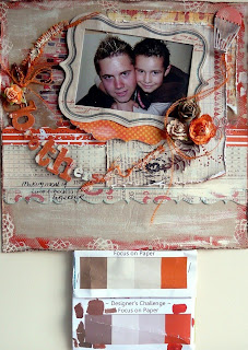
Great colours over at Color Combos Galore with the added Designers Challenge of focusing on a singular picture of a person or object. I went with this photo taken again by my Sister in-law when my kids where visiting.

I loved that it was in black and white which picked up the grey in the background, I then matted it in the grey also. Which I think was Bazzill Basics vintage but don't quote me on that...lol He is also holding a singular object in his hand which is one of his Yughio toys that he received at Christmas, he was absolutely mad on YUGHIO....lol And still at 16 you can find him occasionally watching the tv show...shhhhh not sure if I am supposed to tell anyone else that.


Okay the "Shé's terrific Teal" was a bit of a tricky one, I used a mix of Pthalo Green and Celadon from a range of paints by Jo Sonja, but it dried a little lighter than what I wanted. But their tone was the green side so I was happy with the result anyway. I have painted the chipboard and used the "Crafters Workshop" brick mask and splashed it around the page. I then overlayed with a printed transparency.


I found a doily that was perfect for the Blushing Melon, but needed it to be a little darker so I gave it a dose of Glimmer mist and also made some paint splashes that I cut out and raised.


And last but not least I used some for the Orange Scent stickers, jewels and words and some of the journal block from MM had the orange tone as well. I also did a little bit of doodling in the corners of the page. I love the opportunity of getting a boys page done with out any of the girly fuss and I am sure my son is more than grateful for. I could only imagine how embarrassed he would feel if he was showing his mates and saw anything less than masculine. Generally he checks them to make sure I have not doused with feminine products he is so funny.

Well I hope you can make the time to stop by CCG and check out all the other lovely work submitted by the Design Team and maybe even give the colours ago this week. Look forward to hopefully seeing some of you joining in. Thanks for looking and for any comments that you may wish to leave. Have a great weekend.


Pin It!

Friday, September 9, 2011

Color Combos Galore - 208

I really liked the colours this week over at CCG, soft and pretty with an added splash of a bolder colour. Since I was strapped for time this week with some unexpected dramas unfolding on the home front I opted to do a card instead. I thought my daughter deserved a lovely card for all her hard work of late. The Designers Challenge was to incorporate pearls into your layout so I decided to go with lots of dimensional pearls, Zva pearls I stitched pearls onto the dress form and added a pearl pin. I was quite please with how many I did get on the page.


I used Bazzill Bling infatuation" for the Sugared Lilac and cut from some old MME Wild Asparagus range using my Spellbinders diecut. The Tim Holtz stamp was embossed with white for my "Porcelain Pearl" I have then chalked with some Mulberry Chalk, stitched on lilac pearls and added some rubons and dimensional pearls.


My "Blue Fairy Dust" is Bazzill Basics which wasn't quite the colour so I have chalked to make it more true to the palette. Zva pearls were also used for the embellishments. My "Mulberry Tea" paper is also and old MME Wild Asparagus paper that I punched with a Martha Stewart punch. Two colours of dimensional pearls were used and ribbons are Maya Rds and Making Memories, pearl pin unknown source and lilac metal letters are Petals & Possibilities.

I hope everyone has a wonderful weekend and I hope you get heaps of scrapping done, don't forget to pop over to CCG and check out all the other wonderful layouts.


Pin It!

Friday, September 2, 2011

Color Combos Galore - 207

This weeks colours didn't really mesh well with me, not sure why....I loved the picture and thought it was super cool but I didn't really get my creativity flowing and the colours just seemed a little on the dowdy side. But hey its a colour challenge and sometimes we are not going to get the colours that we want. Okay you could just look at these as simply brown, lilac, cream and red but then what would be the point.

This is a colour challenge so the challenge is then on you to get as close as possible, okay a shade difference that's okay, but ensuring that the correct tones show on your page is what I endeavor to do. For me I am happy when I upload the Palette to the my blog and see my colours pretty close, rather than wondering what Palette I was looking at.

So after pulling paper after paper out and mixing a batch of Raw Sienna with a dash of Olive Green for the Brown Nose Professor, I had to discard and just use papers I really didn't have time to wait for paint to dry, was running a little short of time due to my daughter going for her driving test. The only test she could book and not have to wait for 2 months was about a hours drive away, which was on Tuesday.... nope she did not pass, apparently she didn't do enough shoulder checks. Okay then, so you can do everything else right but apparently not look away from the road enough times. Upset but not perturbed she stumbled across a cancelled appointment, again 45mins away and passed with only two minors, this instructor wanted her to use her rear mirror more.....hmmm

So I'm guessing this is where the real stress begins....lol Her first night out on her own to the movies with friends and on arrival forgot to ring us just to let us know she arrived safely. I'm sure it will get easier.

Now for a quick run down on what I did this week and the products that were used.


I used the following products for the "Brown Nose Professor" 7Gypsy seam binding Fabrique en China, Core Impressions Jenni Bolwin Studio, I sanded this so that I also had the "Words on White" come through. Fancy Pants Alpha Its the little things.


I did a heap of layers using the following products. Basic Grey - Out of Print "Odds and Ends" which has words printed on it as part of the Designers Challenge, I have punched this with MS border punch. Other prints are from BG - Pyrus Rosales, MME Sunshine Adore, and some Sassfrasslass for cutouts. Journalling blocks are BoBunny Party Notes. From the MME paper I cut the doily pattern out, inked and dotted with perfect pearls. The main background paper is from Green Shabby Door, it already had the script words and a slight mauve print in it.


I rubbed rubons from Kaiser randomly around the page PennyRoyale. Other stickers are from Crate Paper Portrait Collection. I used some Websters vellum in the corner of the picture.


This is another picture that my Sister In Law took of my DD whilst we were holidaying in Kalgoorlie, she is standing at the front of the tourist part of the KCGM Super Mining Pit.

Thanks for looking, sorry I was a little long winded with the journalling, for those who did read it all. And I would also like to thank those who regularly stop by and leaving comments. Thanks....


Pin It!

Thursday, September 1, 2011

Black With Two


As most of you know I really enjoy working with a black background, and I almost feel naked when I don't so it only seem fitting when my friend Tracee Provis pointed me in the direction of this site. http://blackwith2challenge.blogspot.com/

They also were having a Design Team call, with only a day before closing date I sent some of my layouts over and was happy when I received an email the next morning from Eve letting me know that I had been selected.

This is a monthly Challenge with the requirements of using black as your main colour and then adding the other two requirments, sometimes it could be two colours other times it may be 1 color and some other element. This Months we had to use Black with Yellow and Blue.


I used some beautiful paper from Websters for the base of the layout and then matted the black cardstock onto it. The papers I have used for the layering are old and new. The new one was from MME called Sunshine Adore paper and the other is from K & Company Wild Saffron Range.


I hand stitched around the photo and used a Matha Steward punch for the border. Other products used are from K & Company, Websters Alpha Stickers and Tim Holtz film Stripe.


Thanks for looking and I hope I catch you over there playing along, and thanks to those ones Jenny, Kristie, Tracee and Shaunery you come along and played last week.


Pin It!